Behind the creative.
Social & digital content.
Content strategy.
Creative workflow.

Project Process & Development
Brand Identity Refresh & Visual Direction
SheShoots already had plenty of personality - bold colour, playful graphics and a nostalgic 90s edge. However as the brand evolved, new colours, inconsistent typography and an expanding collection of graphic elements had created a fragmented visual identity. The challenge was to bring everything together without losing the character and individuality that made SheShoots recognisable.
Rather than starting again, SBC took a strategic approach to identifying what worked, what needed refining and what was getting in the way. This involved rebuilding the existing logo into a clean, scalable vector identity, resolving competing visual elements, establishing a clear colour and typography hierarchy, and refining the brand's retro-inspired graphics into a more cohesive, recognisable visual language that appeared less juvenile but retained the playfulness aspect of the brand.
The outcome was a comprehensive, practical brand system with clear guidelines for consistent application across digital, social and print. A stronger visual identity that gives the photography room to shine, retains the brand's playful personality and makes future creative decisions easier.
Same SheShoots. Less visual inconsistancy. More impact.
AFTER REFRESH
Clean up and Refinement - Already existing Logo/work-mark
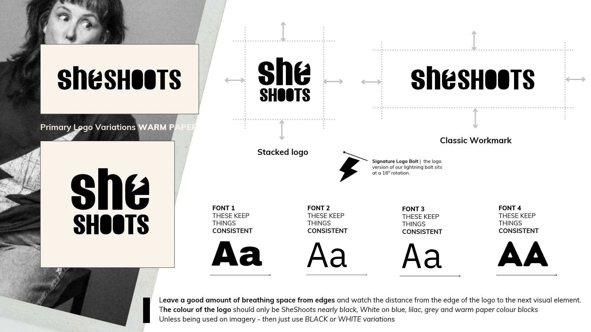
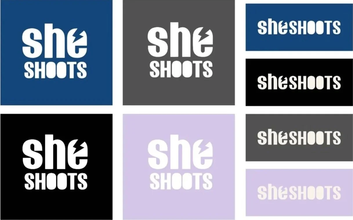
Bringing it all Together Refinement of a Brand
Visual Language / Brand Imagery
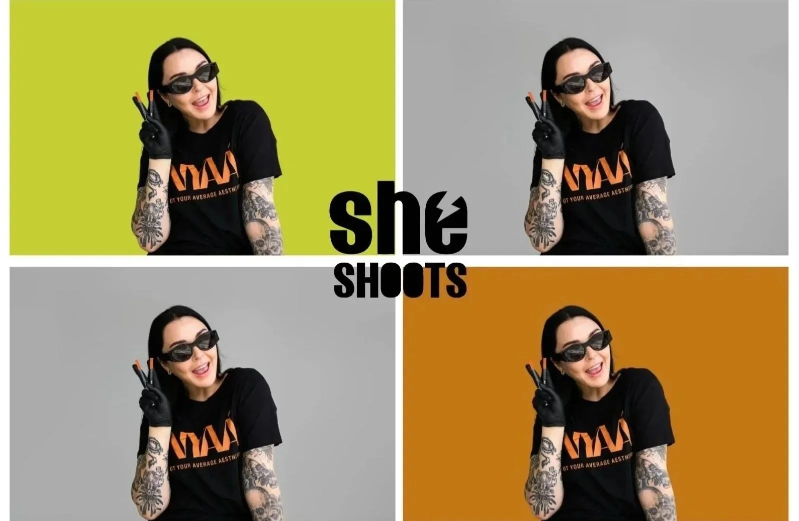

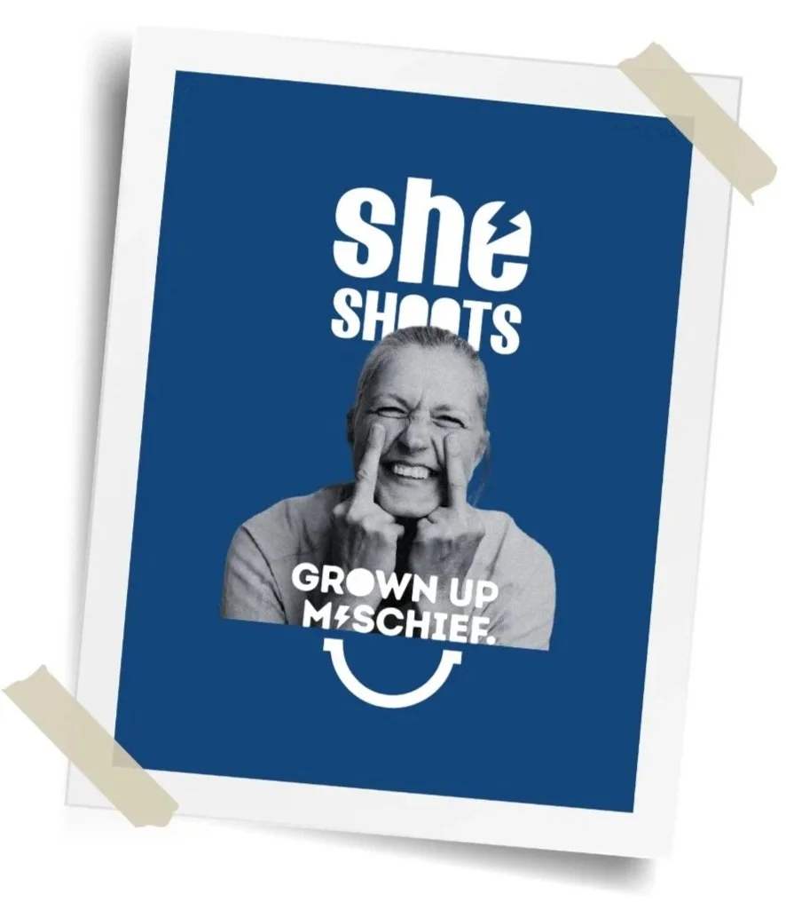
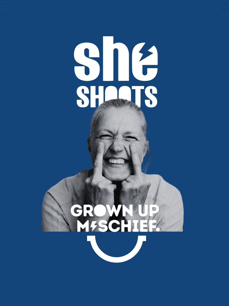
Brand Application concepts

Giving the Brand
a Strong Cohesive
but but ‘not Serious’ Aesthetic.
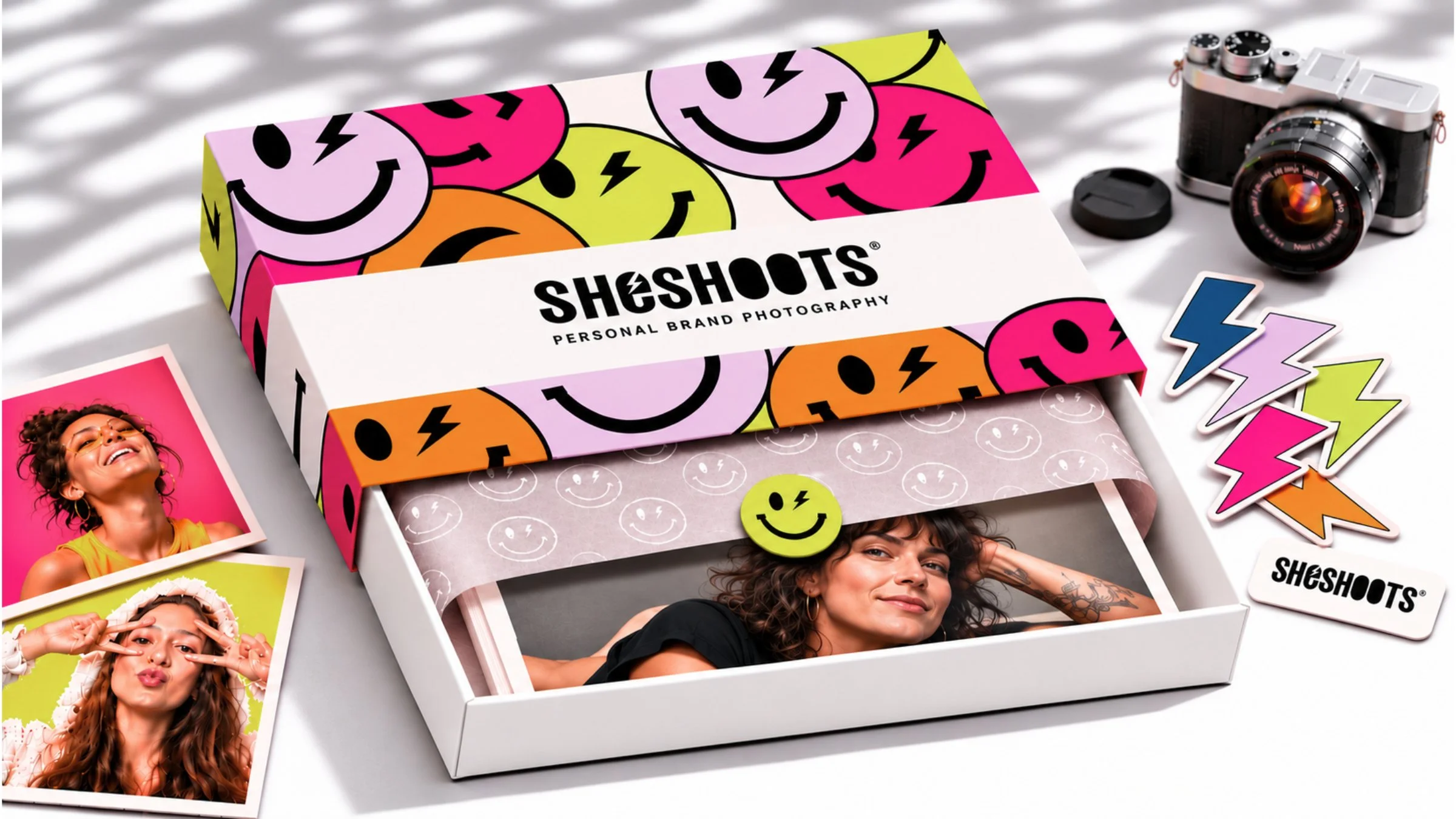
BEFORE
Existing Logo & Elements - no guidelines & lacked cohesion

Social Media, Content & Campaign
Content Creation & Campaign Concepts