

A SICK BRAND BUILD FROM THE GROUND UP.
WELCOME TO SOUTH COAST JIU JITSU - DOING SICK ROLLS SINCE 2022

THE CHALLENGE
South Coast Jiu Jitsu was a brand-new club with no existing identity - just an idea and a vision from its founder.
Rather than redesigning something that already existed, the challenge was to create a brand from the ground up that felt approachable and memorable, within the local community while feeling unmistakably South Coast.
THE INSIGHT
The biggest shift came from redefining what the brand needed to represent. Instead of relying on the visual clichés often associated with martial arts, the goal became creating an identity that kids genuinely wanted to belong to. Confident but welcoming. Distinctive without feeling intimidating.
THE DECISION
Every design decision was made to reinforce that balance.
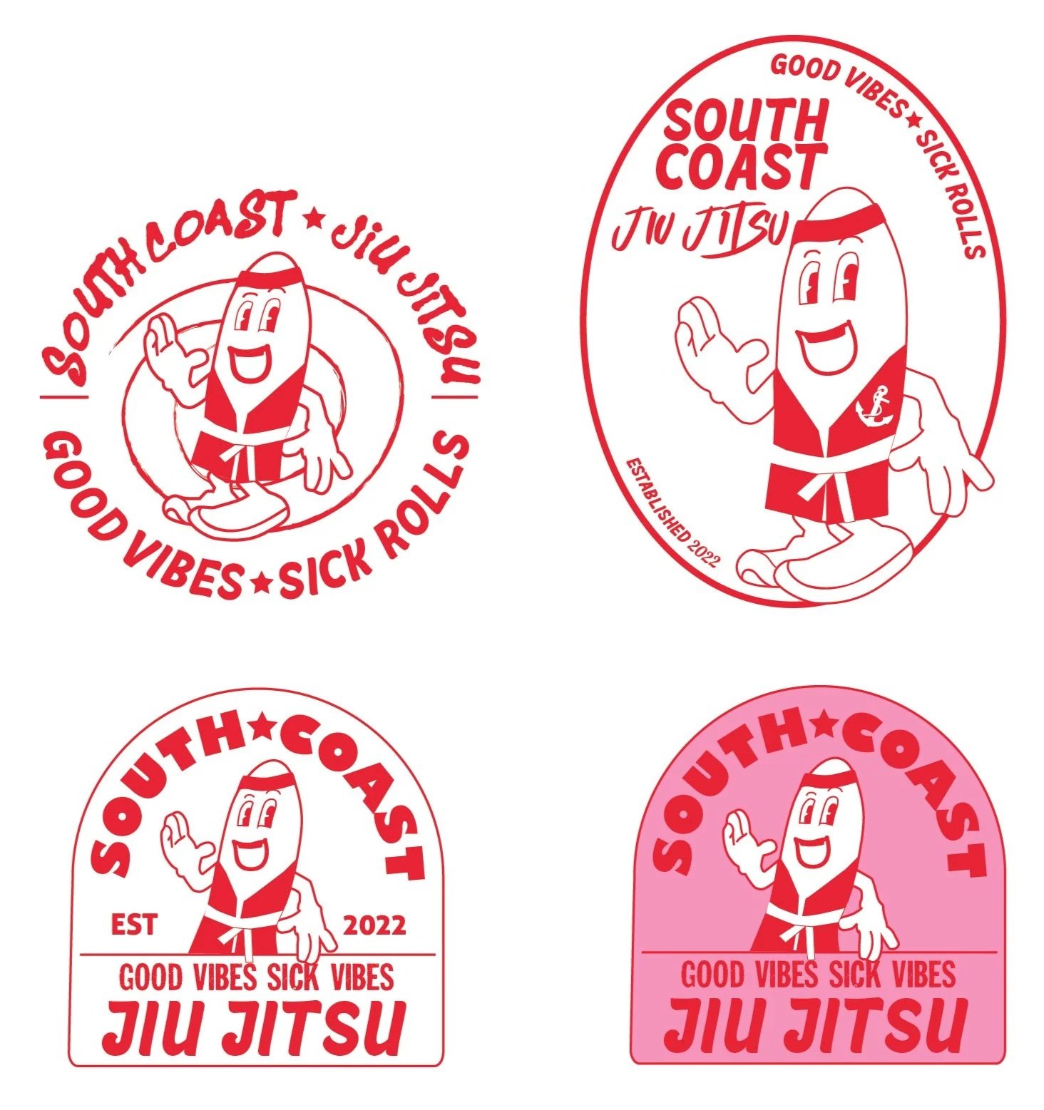
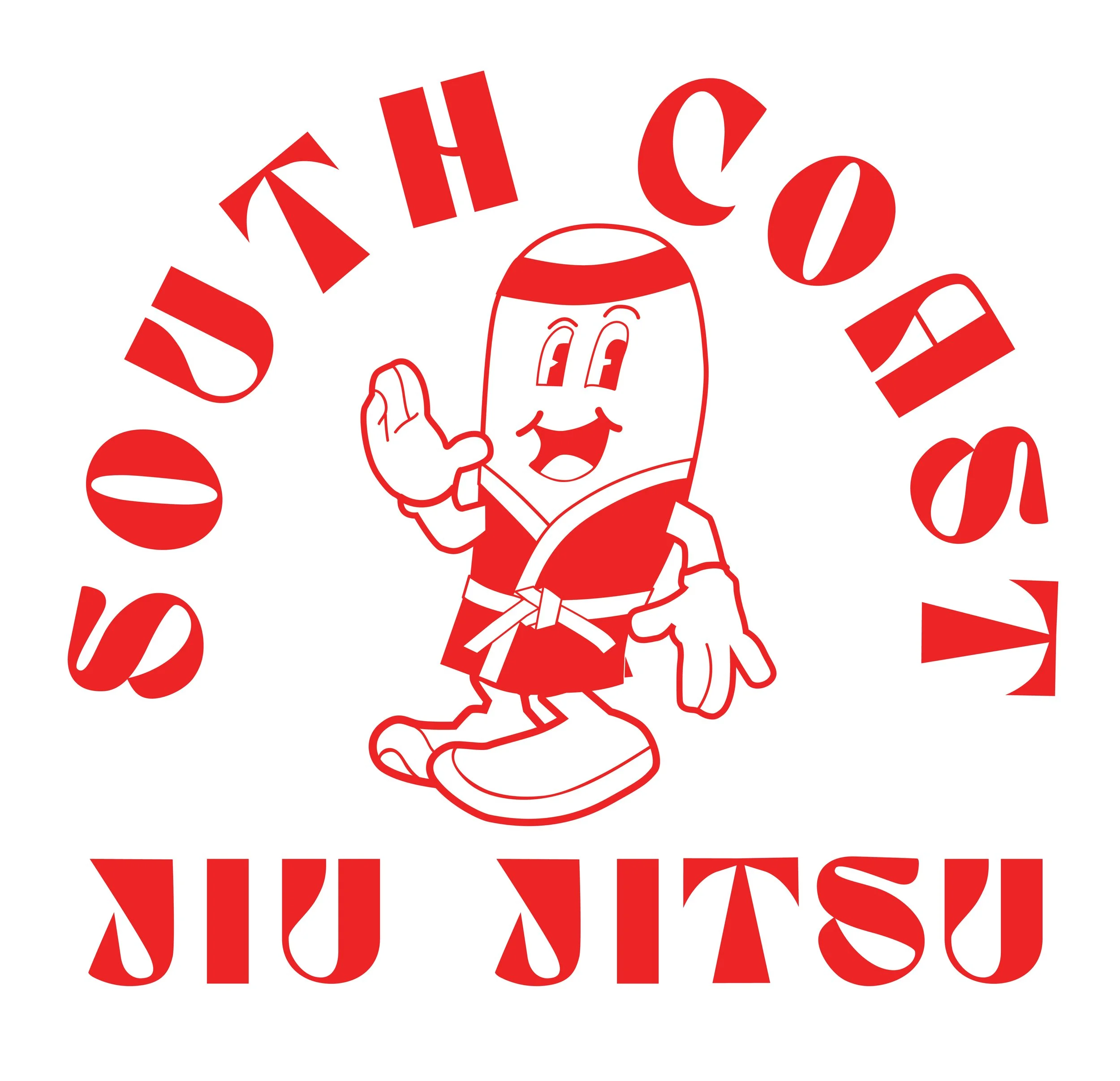
The surfboard-inspired shape connects the identity to the club's coastal location while creating a distinctive silhouette that stands apart from typical martial arts badges.
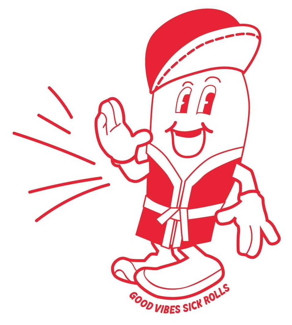
The mascot became the heart of the identity, giving the club an instantly recognisable character that members could connect with and wear proudly.
The colour palette balances energy with longevity. Bright enough to feel optimistic and memorable, yet restrained enough to remain relevant for years rather than seasons.
THE OUTCOME
The result is a flexible identity system that gives South Coast Jiu Jitsu an unmistakable presence from day one. Built to work across apparel, signage, social media and merchandise, the brand provides a strong foundation that can grow with the club for years to come.
THE EVOLUTION | CHARACTER AND ASSET DEVELOPMENT
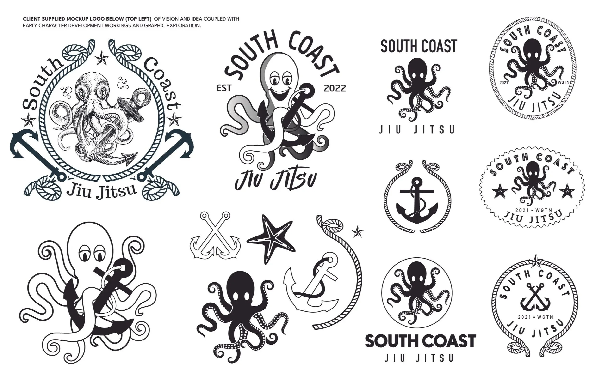
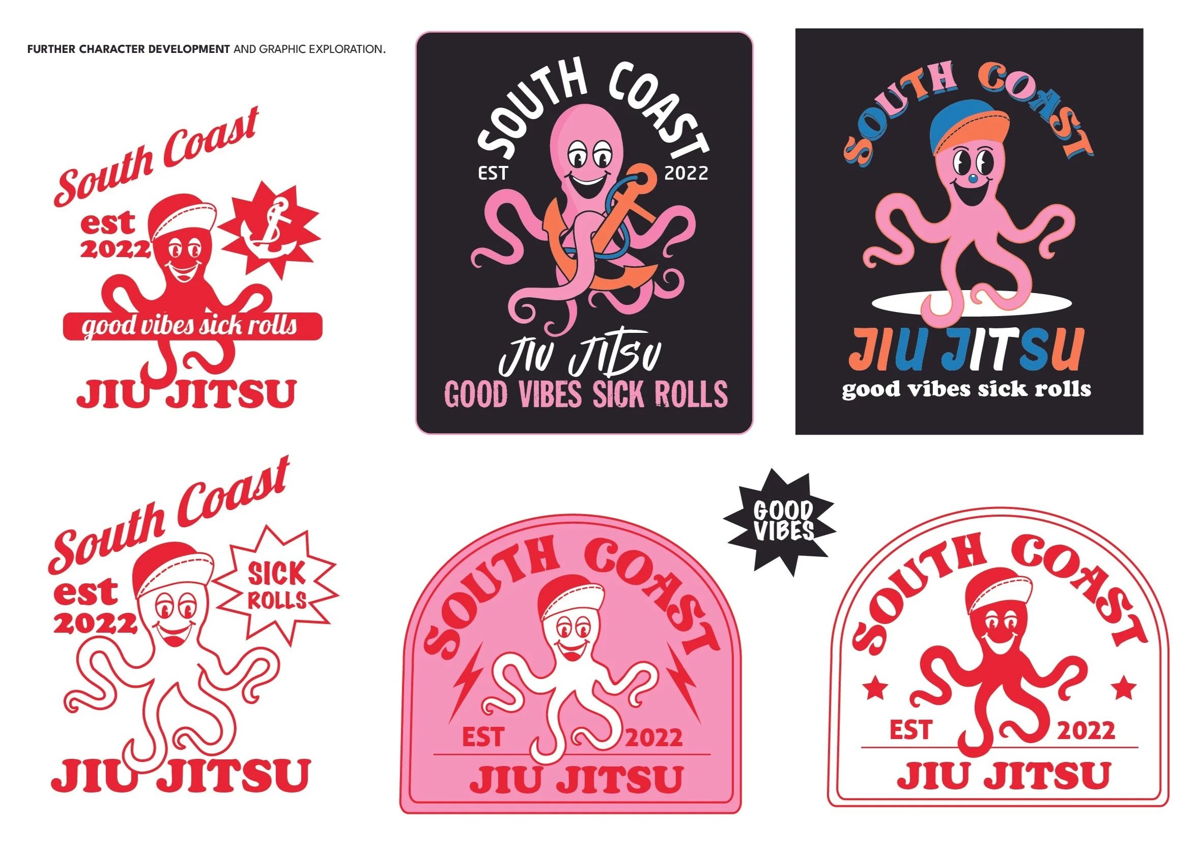
Every identity starts with exploration. I tested different badge structures, mascot styles and typography before refining the system into something that felt distinctive, approachable and unmistakably South Coast. The client supplied a logo they envisaged for their brand. Initially the mascot was going to be an octopus but I felt we could come up with something even more inlign with South. This is how Surfboard guy was born.
CLIENT SUPPLIED MOCKUP LOGO BELOW (TOP LEFT) OF VISION AND IDEA COUPLED WITH EARLY CHARACTER DEVELOPMENT WORKINGS AND GRAPHIC EXPLORATION.
FURTHER CHARACTER DEVELOPMENT & GRAPHIC EXPLORATION.
CHARACTER EVOLUTION INTO SURFBOARD GUY
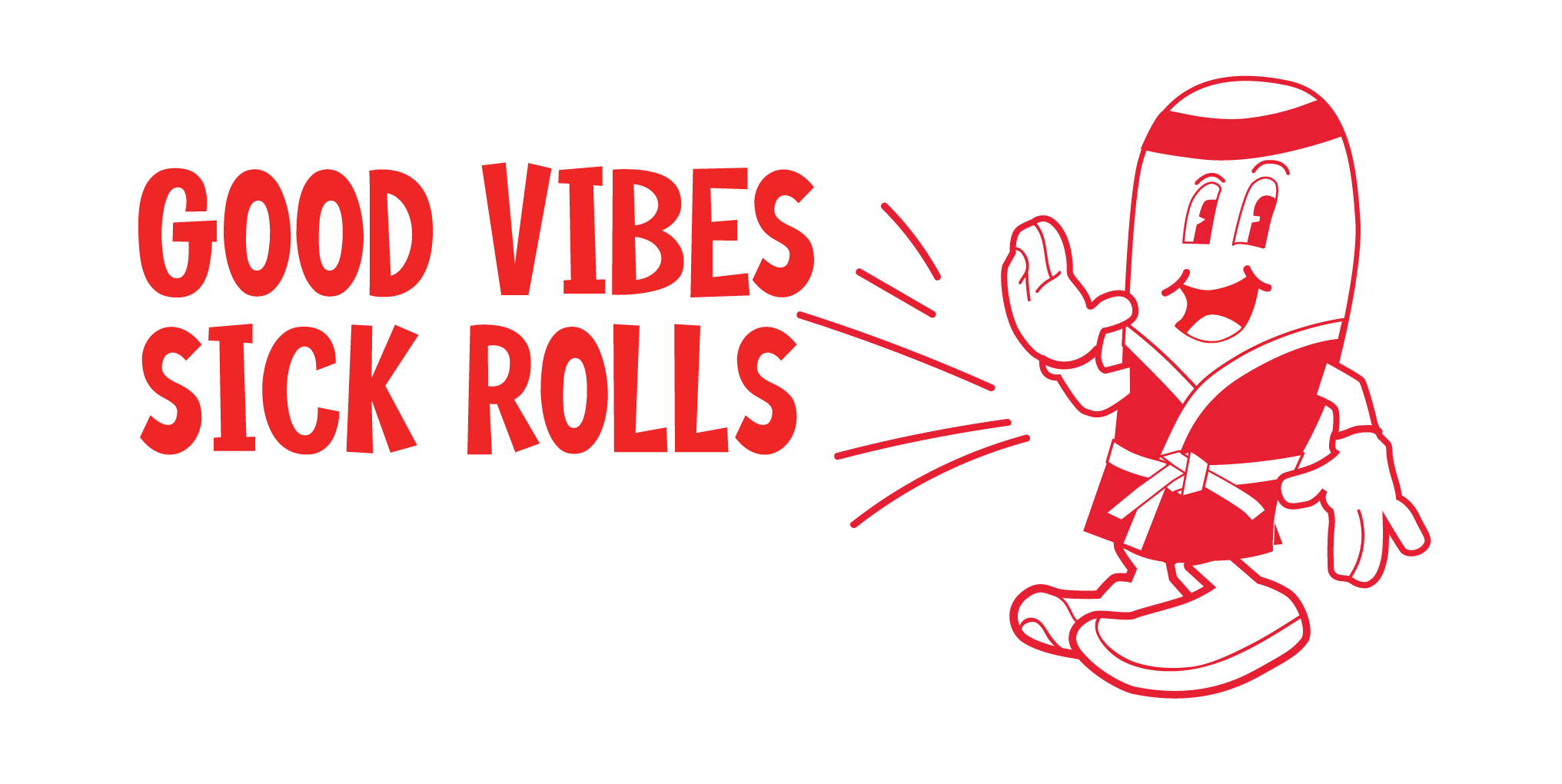
FINAL BRANDING DIRECTION

BRAND PERSONALITY
Friendly. Confident. Coastal. Community-driven. Playful. Memorable.

